CASE STUDY
ROLE
TEAM
TOOLS
DURATION
01 / OVERVIEW
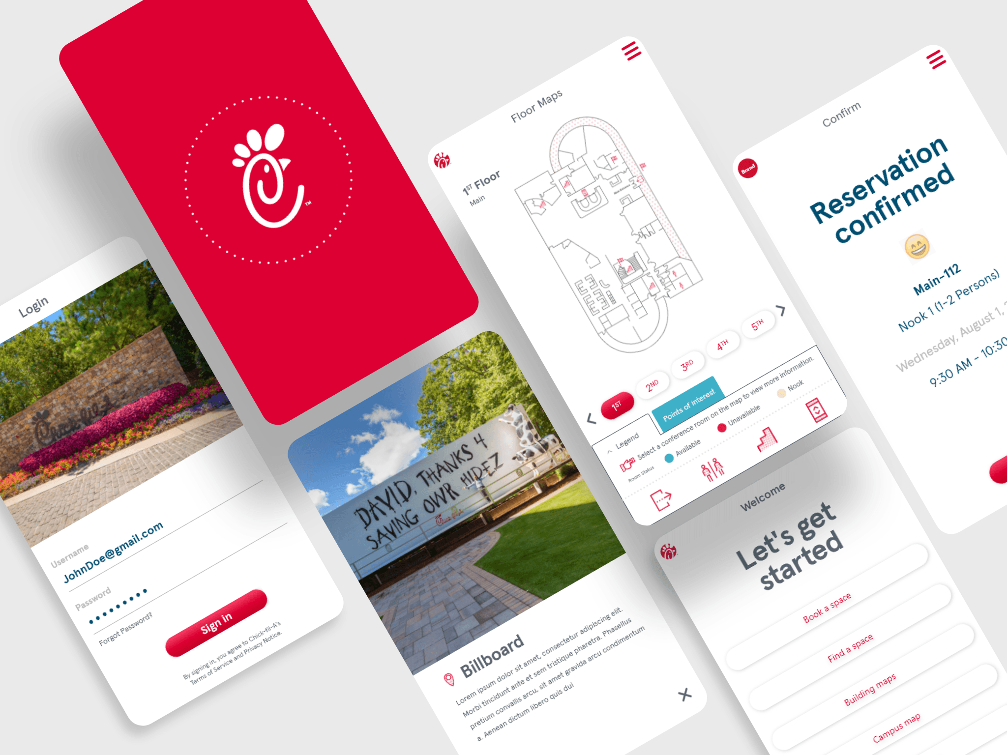
Chick-fil-A’s corporate headquarters near downtown Atlanta runs on an open-office model — desks and meeting rooms aren’t permanently assigned, they’re reserved as needed. The goal was a mobile app that let employees and visitors find and book the right space quickly, without the back-and-forth that usually comes with shared space.
02 / THE PROBLEM
Employees struggled to select appropriate spaces for meetings, which led to double bookings and rooms missing equipment people assumed would be there. The fix needed to put enough information in front of someone booking a room — capacity, available technology, indoor vs. outdoor — that everyone showed up expecting the same thing.
“A problem is a chance for you to do your best.”
DUKE ELLINGTON
03 / RESEARCH & PAIN POINTS
Research surfaced four recurring frustrations:
04 / PERSONAS


05 / MY ROLE
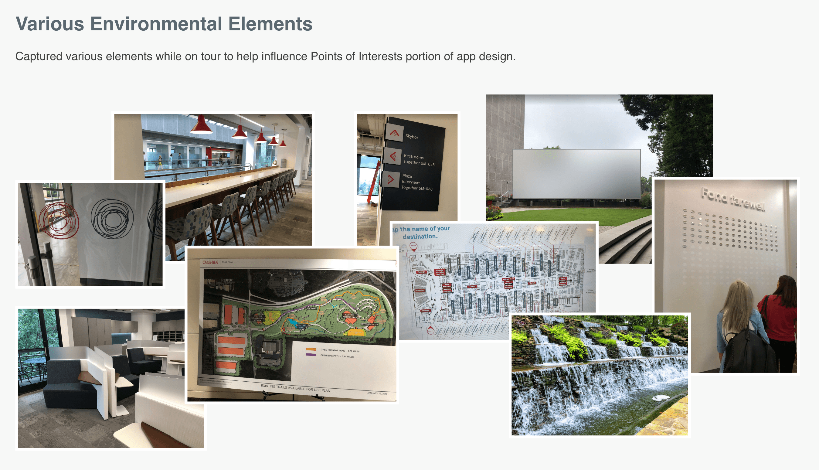
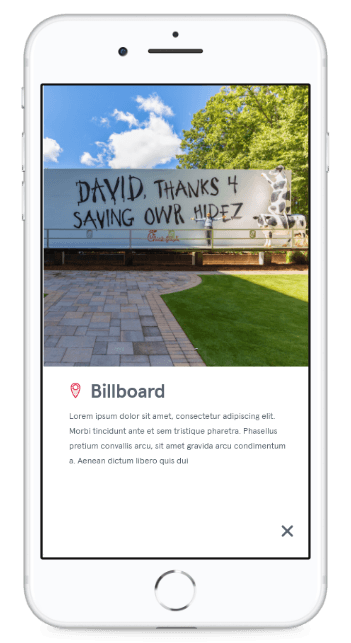
I collaborated with a team of designers, project managers, and developers to build a friendly, visually cohesive booking app. During ideation, my focus was research: touring the facilities with stakeholders, hiring a photographer to document indoor and outdoor spaces used for hoteling, and visiting locations firsthand to see how employees actually moved through them. That groundwork showed the visual language and environmental wayfinding across campus were already consistent — which meant the app could lean on real building photography rather than abstract icons alone. For the booking flow itself, I drew inspiration from tools people already trusted, like Microsoft Outlook and Google Calendar, rather than inventing a new mental model from scratch. During implementation, my focus shifted to visual and interaction design, working directly with a back-end developer to get real data flowing into the app.
06 / PROCESS
The basic task flow starts at sign-up or login, then branches into what the user actually wants to do: book a space, find a space, check building maps, view the campus map, track the shuttle, or browse points of interest. Wireframes for each screen were built and linked together before any visual design work started, so the full structure could be tested as a flow — not just as individual screens.


07 / DESIGN SYSTEM
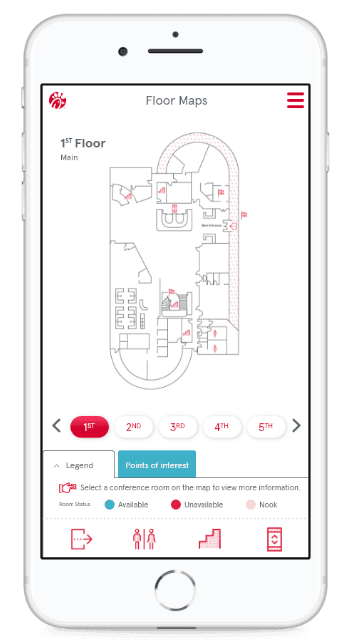
Color, type, custom wayfinding icons, floor maps, and environmental photography were pulled together from the existing brand style guide and on-site documentation to make the app feel native to the campus.


SHUTTLE TRACKING
One persona wanted something closer to a rideshare app — a way to see the shuttle’s real-time location instead of guessing when it’ll show up. That reframing shaped the shuttle feature: live location tracking built into the same app as room booking, not a separate tool.
08 / THE SOLUTION
The finished app let employees and visitors view and reserve open-office spaces on the same shared system — checking capacity and equipment before booking, not after arriving. It folded in the research findings directly: real building photography for points of interest, a booking flow modeled on calendar tools people already knew, and shuttle and campus-map access built into the same app instead of scattered across separate tools.

FINAL LOGIN SCREEN / HI-FI
FINAL FLOOR MAP SCREEN / HI-FI

FINAL BOOKING CONFIRMATION / HI-FI
FINAL POINTS OF INTEREST / HI-FI
09 / REFLECTION
IMPACT
The project gave a much deeper understanding of how research and stakeholder feedback shape a finished product — the client’s response and the usability data gathered along the way both fed directly back into the design decisions.
WHAT I LEARNED
This project reinforced how much research and testing matter when a product has to serve genuinely different needs at once — an employee racing between meetings, a visitor who’s never been on campus before, a relations manager living on the shuttle. Keeping stakeholders and the dev team in sync throughout mattered as much as any individual screen design.