CASE STUDY
ROLE
TEAM
TOOLS
DURATION

01 / OVERVIEW
Arrival should not be a scavenger hunt.
The Tepper School of Business building is a hub for a wide range of campus activity — daily classes, executive education programs, and a steady stream of prospective students touring with their families. Every one of those visitors needs the same basic thing on arrival: a fast way to find a room, a person, or an event without having to stop and ask a stranger.
02 / THE PROBLEM
The building had no unified way for students, faculty, staff, or visitors to locate departments, look up contact information, or get directions to a specific room. The fix needed to work as a kiosk-based wayfinding system flexible enough to be deployed across seven separate physical locations throughout the building, each one carrying Tepper’s and CMU’s brand consistently.
“Focus on the solution, not the problem.”
JIM ROHN
03 / MY ROLE
I owned the visual and experiential design end-to-end — wireframes, high-fidelity screens, and front-end implementation. The central objective was simplifying the wayfinding flow: getting someone from ‘I don’t know where I am’ to a confirmed route in as few taps as possible. I also worked directly with a back-end developer to pipe directory data out of spreadsheet exports and into the CMS, so staff changes and room updates stay current without touching the design layer.
04 / PROCESS
Early wireframes locked in the core screen types before any visual design started. From there the work moved into high-fidelity screens: a welcome screen anchored by building photography, a filterable faculty & staff directory, and floor maps that plot a live route from a ‘YOU ARE HERE’ marker to the selected destination.


05 / INTERACTION MODEL
Four patterns carry most of the weight in the kiosk:
SWIPE — paging through long directory lists on a touch surface with no on-screen scrollbar
MAP TOGGLE — switches between a zoomed floor plan and the full campus map without losing context

HIGHLIGHT INTERACTION CAPTURE

SWIPE INTERACTION CAPTURE
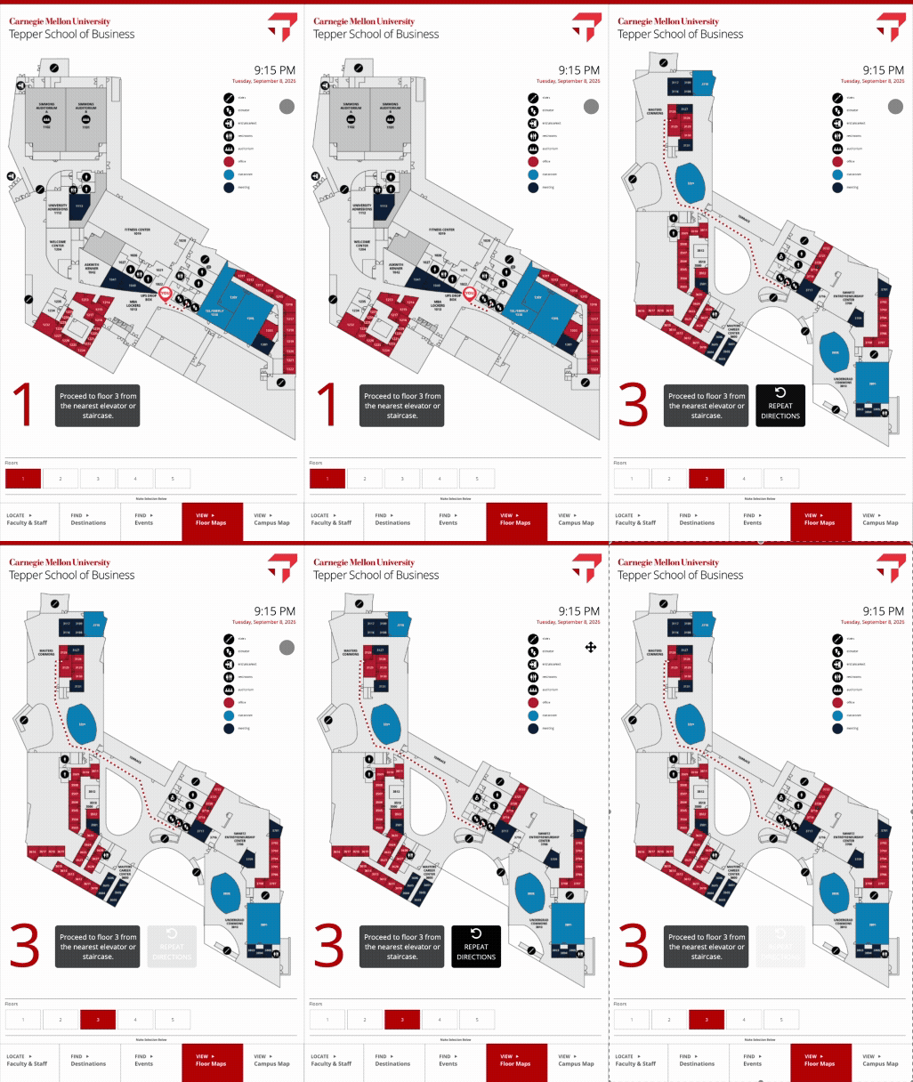
PATH INTERACTION CAPTURE

MAP TOGGLE INTERACTION CAPTURE
06 / ACCESSIBILITY
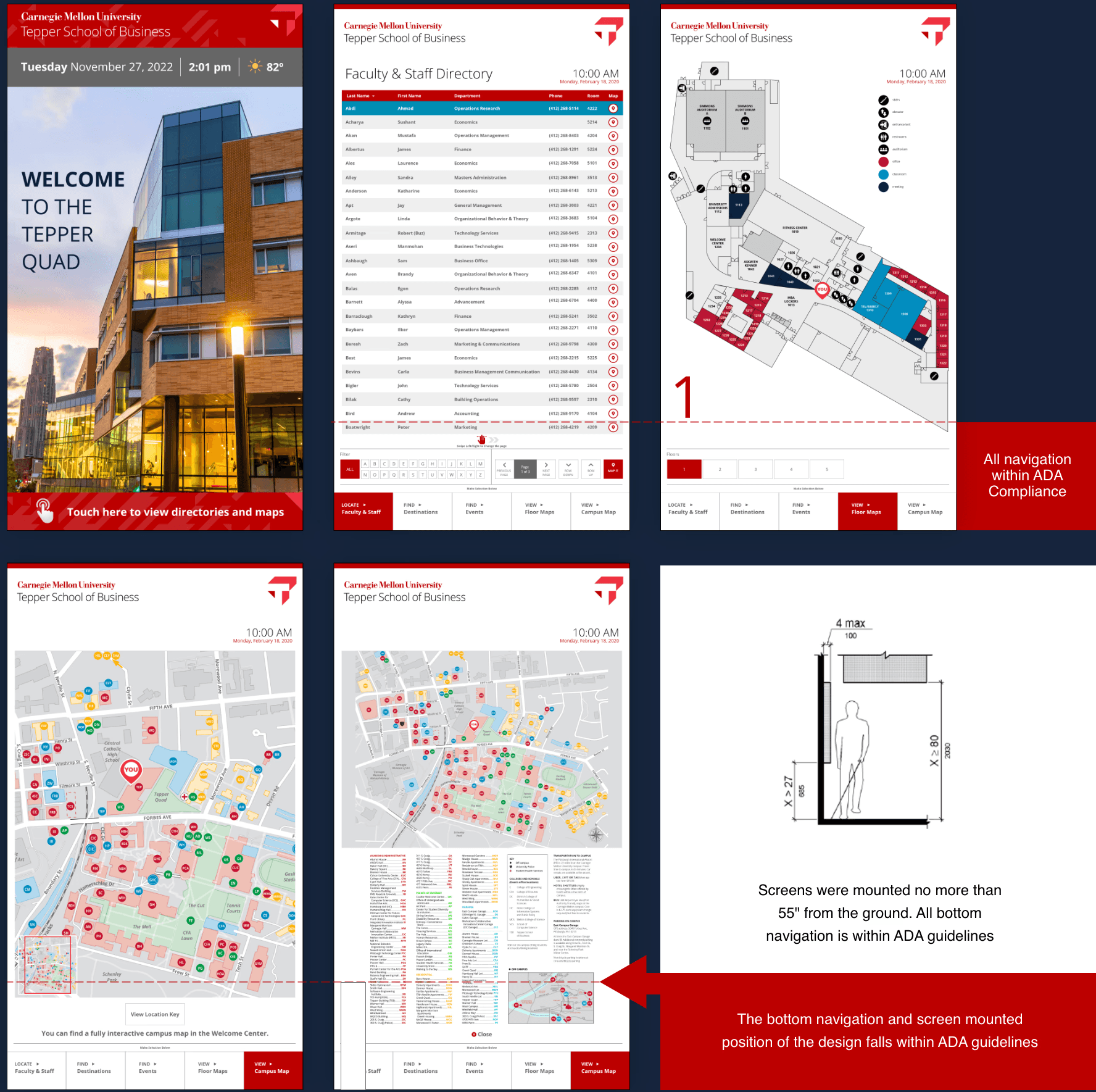
Every kiosk was designed to ADA guidelines from the first sketch, not retrofitted afterward: screens are mounted no more than 50 inches from the ground, and every navigation control sits inside that same reachable zone. That constraint shaped layout decisions throughout — button placement, tap-target size, and how much information could realistically live within reach at once.


07 / THE SOLUTION
The finished system runs across all seven kiosk locations, each pulling from the same CMS-managed directory data. It removes the need for front-desk staff to hand out paper maps, and gives every visitor — regardless of ability — the same reliable way to get where they’re going.

FINAL WELCOME SCREEN / HI-FI

FINAL CAMPUS MAP / HI-FI

FINAL FLOOR MAP / HI-FI

FINAL DIRECTORY SCREEN / HI-FI
08 / REFLECTION
OUTCOME
The Tepper kiosk was well received, and its success became the basis for extending the same wayfinding system to other buildings on campus.
WHAT I LEARNED