CASE STUDY
ROLE
TEAM
TOOLS
01 / OVERVIEW
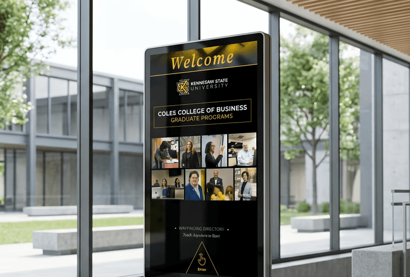
One place to get oriented.
A single interactive kiosk for KSU’s Coles College of Business Graduate Programs, giving students, faculty, and visitors one place to find a classroom, check today’s events, look up a person, or locate any destination in the building — with every interaction duplicated for ADA accessibility. Behind the scenes, two developers connected the directories to a live CMS, so room, faculty, and event data could be updated without touching the design layer.
02 / DISCOVERY
Clear boundaries before pixels.
Before any design work started, the client completed a discovery questionnaire that set clear boundaries for the work. They described their brand in a short list of words — intelligent, clean, accessible, innovative, academic, career-focused, community-oriented — and named the two colors they wanted most: black and gold. Their definition of success was just as concrete: students needed to find a classroom fast, a visitor needed to know immediately if they’d walked in the wrong entrance, and the system needed to reflect room and event changes without a lag.
I worked directly with Alejandra Thomas, KSU’s Senior Environmental Graphic Designer, who reviewed the direction early to keep the kiosk’s floor map visually consistent with the static directional signage already installed elsewhere on campus. That relationship shaped a lot of what came next: the final floor map wasn’t built from scratch, it was developed in coordination with the artwork her team already had in place.
03 / PROCESS
From placeholder to polished.
The first mood board tested the interaction pattern and layout using placeholder content — generic directory entries standing in for real KSU data — before the actual college content was ready. It found an early visual direction without yet being tied to KSU’s identity. The second draft applied KSU’s real black-and-gold branding across the full flow: Welcome, Floor Map, Events, Faculty & Staff, and Destinations. That draft went to Alejandra for review.


Her feedback was specific and got folded directly into the next revision: swap the header type to KSU’s own Source Serif Pro, center the header wording, add the college and department name to the top of every screen, reposition and rotate the floor map so it matches the visitor’s actual orientation standing at the kiosk, and add a legend entry distinguishing other KSU departments from Coles College’s own spaces.
headers utilizing ksu geometric pattern before client updates

showing client header adjustment request

04 / THE FLOOR MAP
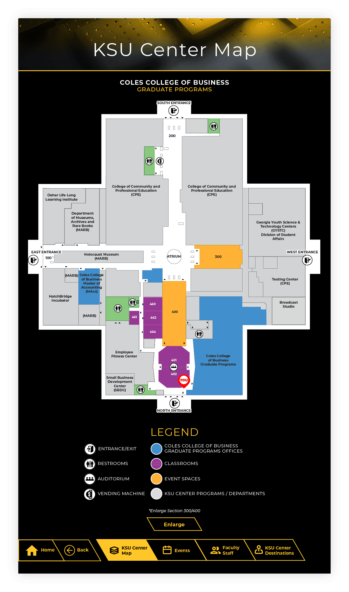
From CAD export to a map anyone can read.
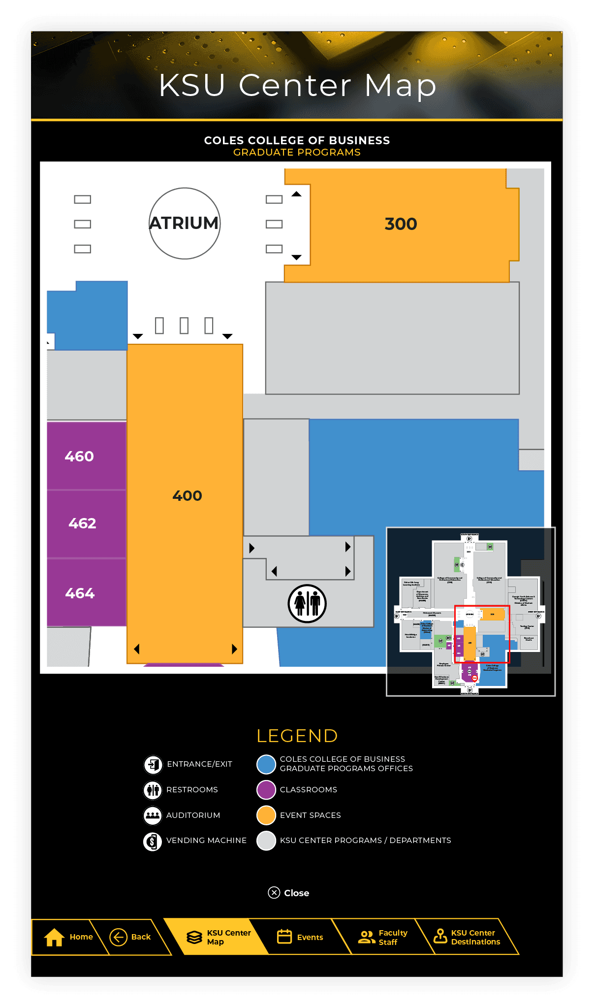
The starting point was a raw architectural CAD export — accurate, but illegible to anyone without a facilities background. The finished map is color-coded by function, carries a full icon legend for entrances, restrooms, and vending, and marks the kiosk’s own location directly on the map.


05 / DESIGN SYSTEM
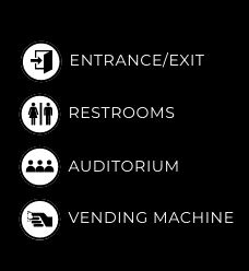
A signage system, translated for touch.
COLOR
TYPE

ICONS

BUTTONS

MOBILE HANDOFF
Turn-by-turn, sent straight to your phone.
The mobile handoff here is genuinely different from the QR-code pattern used on other projects: instead of scanning a code, a visitor enters their phone number and receives turn-by-turn directions by text message — a different solve for the same underlying problem, fitted to what this client’s system supported.


06 / THE SOLUTION
Four paths, one reliable interface.
The finished kiosk covers four core paths — Floor Map, Events, Faculty & Staff, and Destinations — each filterable and sortable, each offering a live routed path from the kiosk to a selected destination.



07 / REFLECTION
What I learned
Client desires don’t always align with user needs — and this project put that tension front and center. I pushed to keep the design grounded in what would actually help someone navigate the building, and where the client’s preferences pulled against that, we found compromises: a handful of brand decisions and small inconsistencies I’m not fully satisfied with, but the core functionality stayed intact throughout. It’s a balance I now think about deliberately on every client project — which battles are worth fighting for the user, and which to concede without letting the experience break.